Saturday, July 14, 2012

The Architect's Alphabet - by Rudyard Kipling


A was an Architect: B were his Brains
C was the Chaos he wrought when he used 'em
D was the Dissolute course of his Drains
E was the End of the people who used 'em
F were the Fools who allowed him to build
G were his Gehennas of brickbats and lime
H were his houses, bacteria filled
I am the poet who left them in time
J were his Joists- but they broke with the rats on 'em
K were his Kements (I adhere to this spelling)
L were his Leadings- you couldn't swing cats on 'em
M was the Mildew that clove to each dwelling
N was his Notion of saving expense
O were the Odds it would cost like all Tophet
P (please insert for the sake of the sense)
Q were his Quantities, P was his Profit
R were his Roofs which were waterlogged rafts
S for they Sagged (S is also his Sinks)
T the Tornadoes he told us were draughts
U were his Usual Unspecified Stinks
V was the Vengeance I vowed on the head of him
W was Wrong and Waiting and Waste
X is King Xerexes (God knows I have need of him!,
Y and a Yataghan wielded with taste)
Z are Zymotic diseases, a host of 'em
Ambo's my architect, I have got most of 'em.


PREPARATION OF AN ARCHITECTURE PORTFOLIO

I have been receiving a lot of requests from students for details on HOW TO PREPARE A GOOD ARCHITECTURE PORTFOLIO. 

Taking this into consideration, I have compiled a detailed booklet on how to create a great portfolio, which will guide you through the detailed process, including identification of materials, ideal layouts, graphics and rendering styles, text placements, photographing your models....an exhaustive list which will guide you step by step.

You can now avail this great resource for creating your best portfolio, which is essential in this highly competitive age - either to get into good firms for internships, applying for your masters or for getting that coveted job.

Get full access to 'How to prepare an Architecture Portfolio' !!!


So go ahead and mail me at ar.sujithgs@gmail.com to order today! 

Stapati - Ar.Tony Joseph's Office, Calicut


What first caught my attention & straightaway my admiration was the beautiful indirect entrance to the building the five storeyed glass facade looks imposing from the front but the building reveals itself when one approaches the entrance which is neatly tucked away on the northern side.

Huge slabs of natural rough granite form the treads of the wide stairs. You have to climb up along the side of the building, then turn 90 degrees to enter virtually into the heart of the structure through a thick clump of foliage on either side. There is a huge King’s Palm literally inside the building, which helps in reducing the scale of the massive 4 storeyed high entrance void. Smaller palms and other plants create a thick green plumage which literally brushes you as one passes through the interesting stairs laid through the middle. The transition is highly effective, as one enters from the outside world to an entirely different one on the inside.


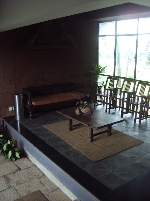
There is a small sun drenched alcove which serves as the meeting area. Old wooden chairs and a divan along with a beautiful old door shutter which serves as a center table give character to the space. There is an ornamental gable, which was part of some old temple, hanging from an exposed laterite wall on the side.


Past the intimate reception, the major feature is the free standing metal stair with its thick wooden treads. The wood is not polished or treated but left to age gracefully, which bestows an old world charm to the exterior staircase. This, combined with the inclined black metal balustrades, creates a feeling of balanced tension.

On the two floors above, there are two rectangular blocks connected in the centre by an open room, which serves as a discussion space. On the 2nd floor there is a studio on one side whicle on the other is the library and one of the main activity hubs in the office – the pantry cum dining space with its large airy seating opening out onto the wooded hillock on the east with the Canoly canal in the foreground. This is the space where the entire office gathers together for ‘chai’ in the morning and the afternoon and witnesses interesting discussions on everything under the sun, right from architecture to politics to current affairs and even the latest film releases.

On the floor above also, the spaces follow the same order. There is a studio on one side,a central discussion room and on the other side is a large cabin where Ar.Tony sits. A metal sculpture by noted sculptor Mr.K.S.Radhakrishnan welcomes one as one enters the cabin. The large undivided space holds his worktable, a comfortable informal discussion space & a large conference table with a large flat screen for projection & video displays. The entire east facade is a glass wall letting in plenty of natural light all through the day and opening ups views to the wooded hillock beyond. One very interesting feature inside are the tables – Ar.Tony’s tables as well as the large conference table. Both are elegant, minimalistically done – a large glass panel resting on top of a thin rectangular slab of natural granite, with hints of stainless steel as leg supports. This contrast of the smooth & sleek of the glass and the chrome with the rough granite gives a unique character to the space, a combination of the traditional and the modern that is characteristic of Stapati’s architectural vocabulary.

The studio spaces are similarly restrained in their treatment. Large open, airy, well lit spaces,  framing views of the nearby lake and that of the lush greenery all around. The layouts are those of open workstations with a few discussion tables. The colour palette of the white walls, the green kota flooring and the dull wooden coloured MDF tabletops lends the space a subdued cool ambience.

The most notable feel of the entire building is the openness. The large central open volume sets the tone with the huge King palm constantly creating a rustling in the wind and throwing interesting shadow patterns on the exposed laterite walls. The large openable glass facade on the eastern and southern sides creates an open feeling, letting in plenty of natural light & ventilation. The southern side also has lots of coconut trees along the building edge, whose tops reach upto the level of the spaces on the second and third floor. thus when one looks out, it is the shaded dense foliage of the coconuts that are visually very soothing and forms a direct ever present connect with nature.

Works of art are littered all around the office, in the form of paintings, ink renderings, sketches, sculptures, salvaged antiques etc, thereby setting a creative background setting. One is surrounded by beauty, always inspiring and one imbibes that beauty subconsciously.
On the ground, there is a badminton court, which forms the nerve centre of activities in the evenings with everyone, right from Ar.Tony to the administrative staff indulging in a game. The court is surrounded by trees on all sides. There is even a fairly sized vegetable garden with a small waterbody on one side. The omnipresent theme in this office is nature, in her various forms & colours, creating a very comfortable ambience to work in and grow.


PREPARATION OF AN ARCHITECTURE PORTFOLIO

I have been receiving a lot of requests from students for details on HOW TO PREPARE A GOOD ARCHITECTURE PORTFOLIO. 

Taking this into consideration, I have compiled a detailed booklet on how to create a great portfolio, which will guide you through the detailed process, including identification of materials, ideal layouts, graphics and rendering styles, text placements, photographing your models....an exhaustive list which will guide you step by step.

You can now avail this great resource for creating your best portfolio, which is essential in this highly competitive age - either to get into good firms for internships, applying for your masters or for getting that coveted job.

Get full access to 'How to prepare an Architecture Portfolio' !!!


So go ahead and mail me at ar.sujithgs@gmail.com to order today!