Tuesday, July 26, 2011

LUTYEN'S DELHI - PART 2 - CONNAUGHT PLACE

The Connaught place or the Connaught Circus, though not designed by Lutyens is part of Lutyen’s Delhi and was conceived as the Central Business District of the new city. It was also constructed after the inauguration of New Delhi in 1931 and was completed only in 1933. The design of the space was started by W.H.Nicholls, the Chief architect to the Government of India and after he left India in 1917, the design was completed by Robert Tor Russell, who was the chief architect of the PWD, and was named after the Duke of Connaught. The Connaught Place or CP, as it is fondly called, houses some of the headquarters of several Indian firms and is one of the largest financial, commercial & business centres in Delhi.


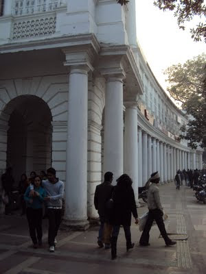
The Collonaded walkway in the inner circle


Architecture of the inner circle buildings
The space is conceived of as 2 concentric circles, creating the Inner Circle, the Middle Circle & the Outer Circle and seven radial roads.
The inner circle of CP is bounded by a two storeyed building ring all around, with a colonnaded passage at the ground level. This is home to all kinds of branded shops, eateries and restaurants, and is a favourite location for the young urbanites to hang around. The space is always bustling with couples walking around through the circular colonnaded space, window shopping or just simply walking around looking at people. There are also the street vendors selling their curios, handicrafts and eatables. The double height passage with the massive columns on one side creates a strong axis of movement, yet at the same time creating a comfortable space due to its semi-open nature. A major disorienting factor in this space is that all around the inner ring, the architecture of the double storeyed buildings with their colonnaded passages is so monotonous that one cannot orient oneself in the space. It is difficult to identify which part of the circle one is in and people often end up walking around the entire circle to find a place or to meet a friend. The only landmark which helps in giving a sense of direction is the LIC building designed by Charles Correa, which stands as a distant landmark with its red sandstone facade.

Google earth image


The main axis of movement
 The central park is frequented by youngsters, couples & even families, who enjoy the evenings sitting out on the lawns. The space below this is converted into a large underground market called the Pallika Bazaar, where you find everything from clothes, to electronic items to softwares and is a bustling places always filled with people.
On one side of the outer circle stands the imposing structure of the LIC building. Architect Charles Correa has designed this monumental structure. The language is that of red Agra sandstone cladding on the external walls with a glass facade and a massive space frame structure to define the entrance space. There is a large flight of steps on the front side, further emphasising the monumental scale of the building.
There is a quaint little market just behind the LIC building, on the Janpath, which is exclusively for garments. There are lines of shops on either side selling T-shirts, ladieswear etc, with a wide central space through which the people move and haggle with the vendors.

Charles Correa's LIC Building


Friday, July 22, 2011

INDIA HABITAT CENTRE, NEW DELHI

The first thing that one notices on entering the Indian Habitat Centre (IHC) is the amazing courtyard inside the building. The tall exposed brick building masses are oriented so as to create a large open space in the centre. The spaces are so juxtaposed that one is led to explore and discover the remaining areas. The courtyard is green, with lots of trees, palms etc, creating an image of a tropical forest, with a constant flow of natural air through the spaces. Sunlight streams into the space, being broken by the large space frame structure on the roof level with blue sun shading elements. Light & shadow play on the textured surface of the building, creating beautiful patterns which change along with the time of the day.

The External Facade

The main entrance to IHC

The Sun-shading device over the Courtyard

One of the reasons why the courtyard is so comfortable is because of its scale. It is monumental. The tall building masses enclosing the large space in the centre are completed by the huge palms & other trees, which tower to the roof. Yet, in spite of the monumental scale, one does not feel lost in this space. There are plants along the base of the large trees scaled to the human height, which help in breaking down the scale. The edge of the planters doubles up as seating spaces for the people. The mystery of the space is further accentuated with level differences & steps leading to enclosed spaces and even a half concealed amphitheatre. There are strategically placed sculptures which give an artistic touch to the spaces.
Play of light & shadow

Plants help in breaking down the scale

Interesting walkways
The building was designed by architect Joseph Allen Stein and is a hub for cultural, economic, business and social events. ‘The Habitat Centre should be conceived as an ideal physical environment with a range of facilities that maximise the effectiveness of the individuals & institutions, in their holistic support of the habitat. The principal resolve of the centre – “to restore at every level – environment and ecological – a balanced, harmonious and improved way of life”, is to be reflected in its concept & design’ (Source – Wikipedia). Theatre performances, folk arts, art exhibitions, film shows and discussion forums create a vibrant active space. There are various gallery spaces for artists like the Visual Arts Gallery, The Open Palm Court & the Experimental Art Gallery, creating a platform for highlighting the creativity of the artists.

Seating spaces


Skywalks connecting the building blocks

 There are different functional spaces in the various blocks, like office spaces, exhibition spaces, conference facilities, cafeterias etc, not only to house the various organisations but to encourage their interaction as well. There are 5 main building blocks which are interconnected by means of aerial walkways. There is also a basement floor for parking of around 1000 cars. The external facade is in a language of exposed red brick, exposed concrete and glass.

As given in the website of IHC - http://www.indiahabitat.org/, 'The India Habitat Centre was conceived to provide a physical environment which would serve as a catalyst for synergetic relationship between individuals and institutions working in diverse habitat related areas and therefore, maximise their total effectiveness'.

Wednesday, July 20, 2011

LUTYEN'S DELHI - PART 1 - RAJPATH

In 1911, the British government in India decided to shift their capital from Calcutta to Delhi, for ensuring better administrative control over the country. It also had the additional benefit that Delhi was near to Shimla, where the Britishers could retreat during the hot summer months. Thus was born the idea for New Delhi.
The underlying concept in the design of the city of New Delhi was to create a Monumental, grand city space which would inspire awe in the minds of the colonial citizens and which would be symbolic of the supremacy of the British rule and culture – a Monumental City.
To create the massive structures which were to form the new capital, British architect Sir Edwin Lutyens was appointed to design the magnificent new capital. He along with fellow architect Mr.Herbert Baker designed most of the structures that form the present capital of New Delhi. The major focus was to be the long axis along the Raisina Hill known as the King's Way, presently called Rajpath, with the India Gate on one side and the magnificent Viceroy’s house on the other end. The Viceroy’s house has been converted into the Presidential palace or the Rashtrapathi Bhavan in post-independence India. Today, the Rajpath has become the symbol of the modern India, with the yearly Repulic day parade through this stretch highlighting some of the progress made in various fields and also the military strength.
 Along with this is the Janpath, which crosses the Rajpath at a rightangle, connecting Rajesh Pilot Marg with the Connaught Place. The other important focus of the plan of New Delhi was a hexagonal pattern which linked governmental, commercial & recreational activities with the residential areas.

Rajpath with the North & South Blocks & Rashtrapathi Bhavan behind


The North Block


Entrance Court to the North Block

The Rajpath is a 2.5km stretch which forms a strong linear axis with strong focuses on either end. One either side of the Rashtrapathi Bhavan are the two Secretariat buildings- the North & the South block, which houses government offices at present. The Rashtrapathi Bhavan along with the North & the South blocks are one of Lutyen’s & Baker’s memorable achievements, in terms of architectural design and scale. The architecture is a synthesis of British Imperialism & Indian elements, with Lutyens & Baker drawing inspiration from Buddhist religious complexes on one hand, and Mughal architecture on the other. There are traces of classical style, with columns and colonnaded verandahs. These are interspersed with chatris, jaalis and chajjas borrowed from the traditional Indian architecture. The composition is symmetrical and formal with a strong central axis and the Rashtrapathi Bhavan as the focus, on top of the Raisina Hill. There is an interesting story regarding the positioning of the Rashtrapathi Bhavan on top of the Raisina Hill. At present, only the top of the dome of the Rashtrapathi Bhavan is vaguely visible from below. While Lutyens intended it to be the primary focus of the composition, Baker was successful in pushing the location of the building back, leading to a lack of clear visibility and also to animosity between the two men.


The Front Facade of the South Block


Indian architectural elements


The Chattris & Chajjas in red sandstone
The North & the South blocks are mirror images of each other, designed by Baker. These linear buildings have a large central recessed space which leads one inside the central entrance into the space below the massive dome. The facade is plain, composed of sandstone clad walls with red sandstone being used on the ground floor walls and yellow sandstone on the upper floors. The red sandstone portion tends to anchor the whole building on a solid base. There are protruding arms on either sides with massive colonnaded porticos to create a very formal composition.
Monumental flight of steps to the South Block


The Dome of the South Block


Inside the masssive dome
The Rashtrapati Bhavan on the end of the axis is the undoubted focus of the composition, with the large black stone clad dome above the front entrance portico creating a strong visual composition. The whole composition is designed around a massive square with many open areas and courtyards within, with separate wings for the Viceroy and Guests. It is massive in size, being larger than the Palace of Versailles, with 340 rooms, 227 columns & 2.4 kilometres of corridors, set in a 330 acre estate.
A major portion of the construction of the buildings was done by the contractor Mr.Shoba Singh, who is the father of author Khushwant Singh.
Rashrapathi Bhavan with the Jaipur column in front


Entrance facade of the Rashtrapathi Bhavan
View towards the India Gate


Illuminated for the Beating the Retreat ceremony


India Gate


Inscriptions on top of the India Gate
The India Gate, originally known as the All India War Memorial is situated on the other end of the Rajpath. This monument, designed by Lutyens, was built to commemorate the Indian soldiers under the British Raj who lost their lives in the 1st World war. After independence, it was converted to house the 'Amar Javan Jyothi' - the Tomb of the Unknown Soldier, where an eternal flame burns. The Gate is 42m tall and is a favourite open space in the city with families using it in the evenings & during holidays.

Tuesday, July 19, 2011

KUTHIRAMALIKA IN TRIVANDRUM, KERALA

The Kuthiramaalika in Trivandrum is located inside the fort complex, on the leftside of the main approach axis of the Padmanabhaswamy temple. This complex of buildings along with the Padmanabhapuram palace is one of the best examples of traditional Kerala architecture, with its beautiful wooden architecture and climate sensitive spaces.

The Entrance to the building with the horsehead brackets which give the name 'Kuthiramalika'

The external facade as seen from the road in front of Padmanabhaswamy Temple

The name Kuthiramalika is derived from the 122 horse figured brackets that adorn the exterior of the palace (Kuthira means horse in Malayalam). This complex was built by the maharaja Swati Thirunal Rama Varma. The complex consists of groups of double storeyed buildings. The language is that of sloping mangalore tiled roofs with eaves decorated with beautifully carved wooden brackets, white washed lime plastered walls, black oxide floorings, intricate woodwork on the ceiling, wooden jaalis etc. The scale is intimate, being further broken down by columns and other elements. There is a play of light and shadow in the interiors, with the light being carefully controlled to create a cool ambience inside. There is an outer layer of wooden jaalis on the outer wall in the upper storey, which almost runs around all the spaces. These jaalis ensure privacy of the people inside while at the same time allowing light & ventilation inside. A unique feature of these jaalis are that they allow visibility from inside to outside but not from outside to inside.
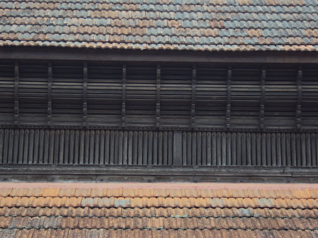
The amazing wooden jaalis work

The 'Mathen Mani' clocktower.

There are verandahs running all around the buildings, with the sloping roofs extending well beyond the edge of the verandah. This ensures protection from the heavy rains and also helps in bringing in diffused light inside the space, reducing glare. There are small courtyards inside the buildings, which help in microclimatic control.

Wood structural work of the roof

The wooden jaalis let in light & ventilation inside and allows visibility to the outside but from outside, it is not possible to see the interiors due to the angle of the wood battens

The major portion of the palace complex is out of bounds for the public. Only a single wing is opened for visiting. This space also houses the various traditional implements, gifts etc. There are window openings from which the top of the gopuram of the Padmanabhaswamy temple is visible. There are beautiful vistas of sloping tiled roofs

A Verandah around the building

The structural members designed as intricate carvings


Roof forms with the Padmanabhaswamy Temple in the background


PREPARATION OF AN ARCHITECTURE PORTFOLIO

I have been receiving a lot of requests from students for details on HOW TO PREPARE A GOOD ARCHITECTURE PORTFOLIO. 

Taking this into consideration, I have compiled a detailed booklet on how to create a great portfolio, which will guide you through the detailed process, including identification of materials, ideal layouts, graphics and rendering styles, text placements, photographing your models....an exhaustive list which will guide you step by step.

You can now avail this great resource for creating your best portfolio, which is essential in this highly competitive age - either to get into good firms for internships, applying for your masters or for getting that coveted job.

Get full access to 'How to prepare an Architecture Portfolio' !!!

So go ahead and mail me at ar.sujithgs@gmail.com to order today! 

Saturday, July 9, 2011

INDUS VALLEY, AUROVILLE

This is one interesting space that will appeal to any architect – both for the architecture as well as for the functional concept. The Indus Valley is a restaurant where the food is totally free. It does not charge anything for the food. The customers can give a voluntary contribution as they deem fit after the meal. Conceived, built and run by architects Dharmesh Jadeja & Dhruv, the Indus Valley is a meeting place for most Aurovillians as well as guests. Set in the lush green campus of the Bharat Nivas, the space is conceived as an outdoor cafe with chairs and tables set in the open environment in the cool shade of neem trees, to encourage interaction between the people in a very relaxed natural ambience.


One enters through a circuitous route through the back.  A series of well thought off steps around a couple of neem tree trunks leads one up to the self service counter cum kitchen. The wide concrete treads of varying widths are a good contrast to the exposed brick vertical walls. There are green cloth fabrics hung across the branches of the trees to provide additional shade and also as a protection against falling leaves – an artistic solution for a practical problem.


There are spaces which encourage groups to interact and relax – informal spaces of interaction. Tables finished with colourful glazed tiles and metal chairs are scattered around the place. Flooring in circular patterns of exposed brick have turned a gorgeous velvety green in the rains which form a contrast with the square concrete tiles with pebble infills. Nature acts as the main backdrop with a gentle wind rustling through the leaves. The built spaces are just optimum, creating a harmonious relation with nature.